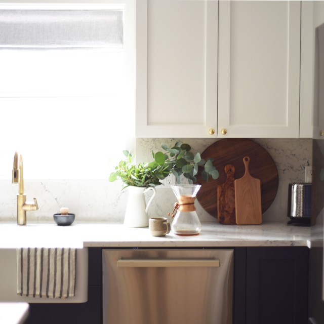
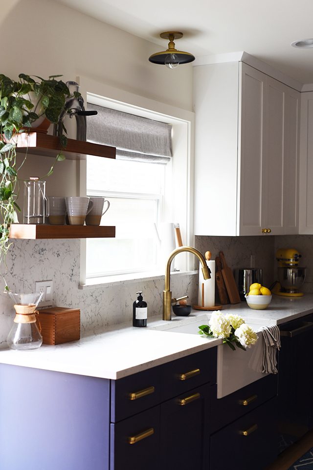
This post feels like a long time coming. If you’ve been following us on Instagram, you know that we spent a good chunk of our summer living through a kitchen remodel. And when I say living, I mean living: we literally lived in our home (with our three kids, no less) over the 6 weeks or so that it took to complete. Overall, I’d say, it went better than expected: we grilled out A LOT, I only had a few meltdowns (mostly all clustered towards the end), and when it was all said and done, we were blown away by the results.
We learned a lot along the way, including that nothing ever goes to plan, and renovating an old house sort of becomes a game of Domino: once one piece tumbles, the rest follow. For us, it involved dealing with issues related to settling, needing to move a wall two more inches than we had planned, and modifying a cabinet front.
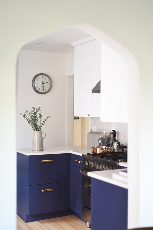
For months, I felt like I had a third, very time-intensive part-time job. I cannot imagine doing something like this during the winter months nor do I want to live through a kitchen renovation again (or at least not for a very, very long time). But man, was it WORTH IT. I can’t emphasize how much delight and joy I get every time I walk through the archway between the dining room and kitchen (we had our contractor match the opening to the other archways in our home, and it feels like it’s been there forever!).
As a family that lives and works out of our home, we knew that we needed to upgrade to a modern kitchen. We needed more space, or more functional space. We needed an oven and stovetop that we could rely on. We needed a refrigerator that could easily store enough groceries for a family of five.
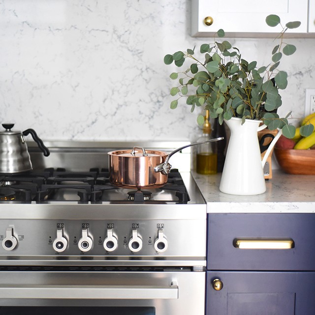
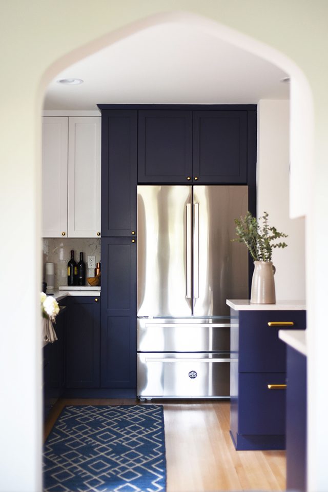
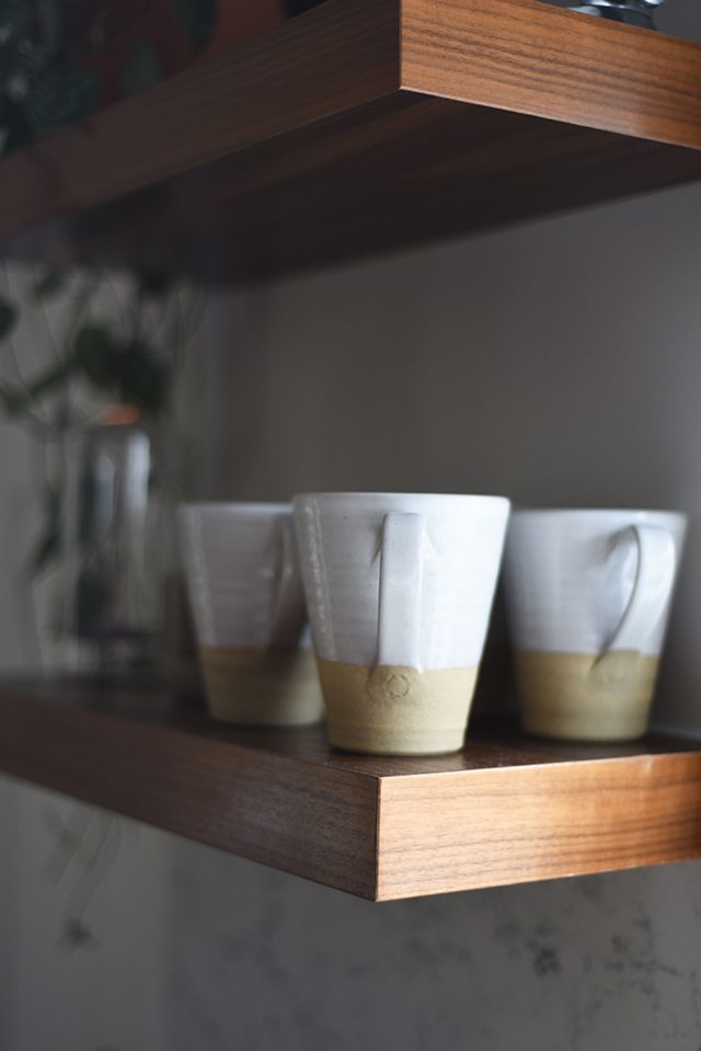
Going down to the studs gave us an opportunity to not only address our needs, but also thoughtfully approach how we wanted the heart of our home to look.
Finding a great kitchen designer and contractor
Somehow I stumbled upon the work of Heidi Caillier (I think I originally found her through another designer I followed on Instagram). We immediately fell in love with her effortless style and aesthetic, and were thrilled when she said she’d be interested in working with us on our kitchen design. Heidi is one of the most responsive, always-on, and creative people I’ve ever worked with. She seemed to always be available whenever I had a question, or needed to figure out a Plan B because Plan A wasn’t working. I literally don’t know where we would be without her guidance.
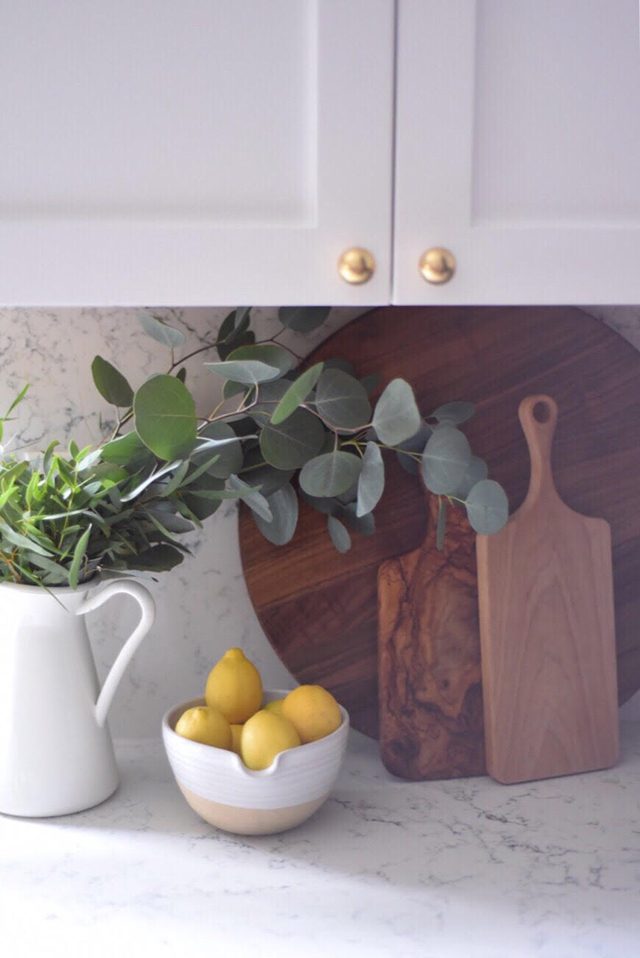
From there, we connected with our general contractor. For anyone who’s ever done a renovation, you probably know that nothing ever gets done on time. But we’ve now worked with our contractor on two different home projects and both were done within the timeline and ON BUDGET.
Choosing custom cabinetry and colors
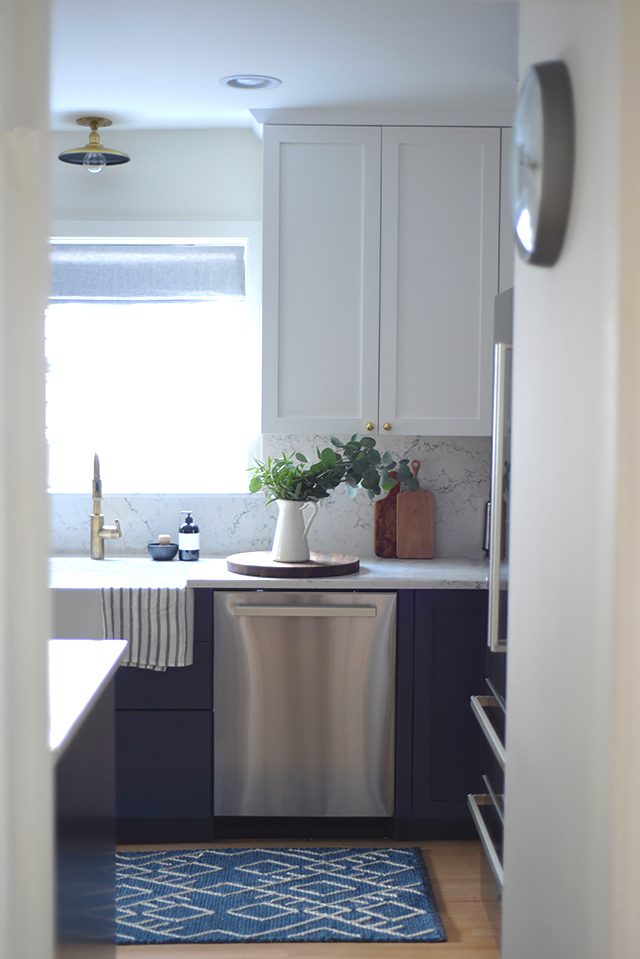
We were thrilled to partner with UltraCraft Cabinetry on planning out our dream kitchen using their Shaker cabinets (they’re committed to manufacturing cabinets using responsible materials, which I really love). I had always dreamed about an all-white kitchen, but once I learned about UltraCraft Cabinetry’s custom color program my imagination really ran wild. We immediately decided we’d do two-tone cabinets, but we weren’t sure what color we’d land on besides white (we chose a color from UltraCraft’s catalogue called Beach White for the uppers).
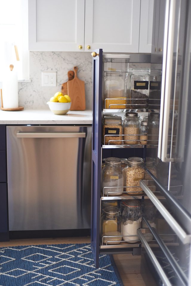
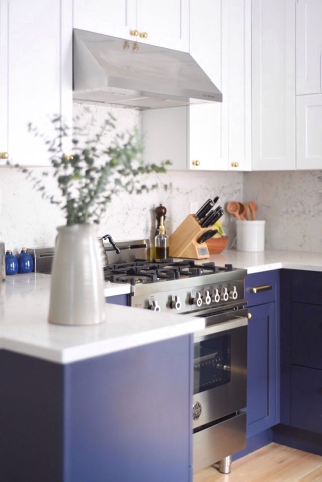
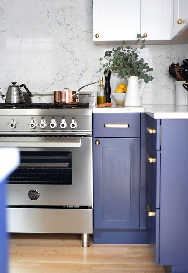
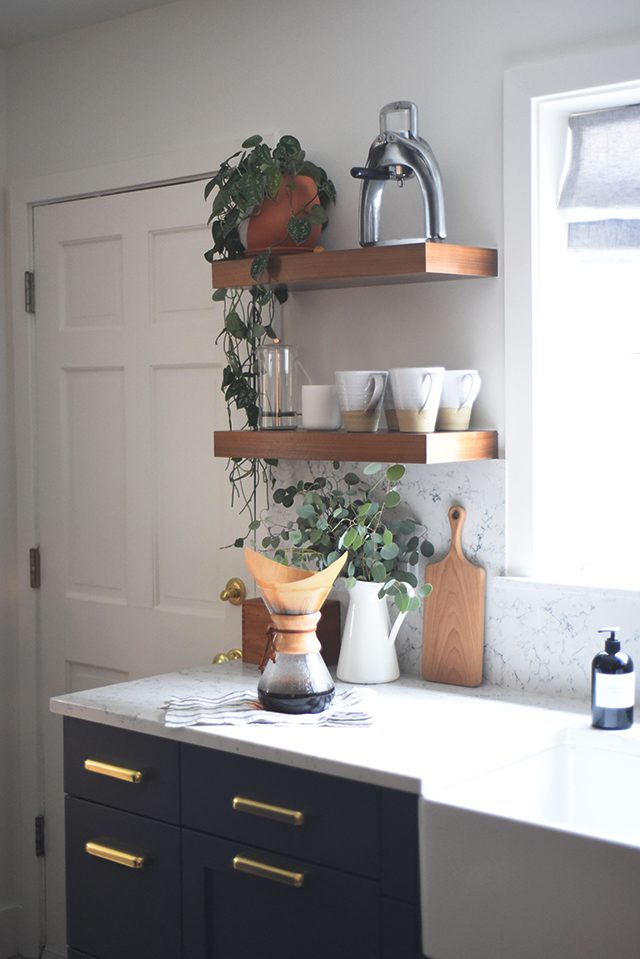
Initially, I wanted to go with a forest green (Matt HATED that idea). Then I suggested gray, but then we landed on a gorgeous navy color in Behr’s color palette (Secret Society, if you’re wondering) and UltraCraft matched it to a tee. The color is both bold, yet classic, making the space feel both modern and traditional.
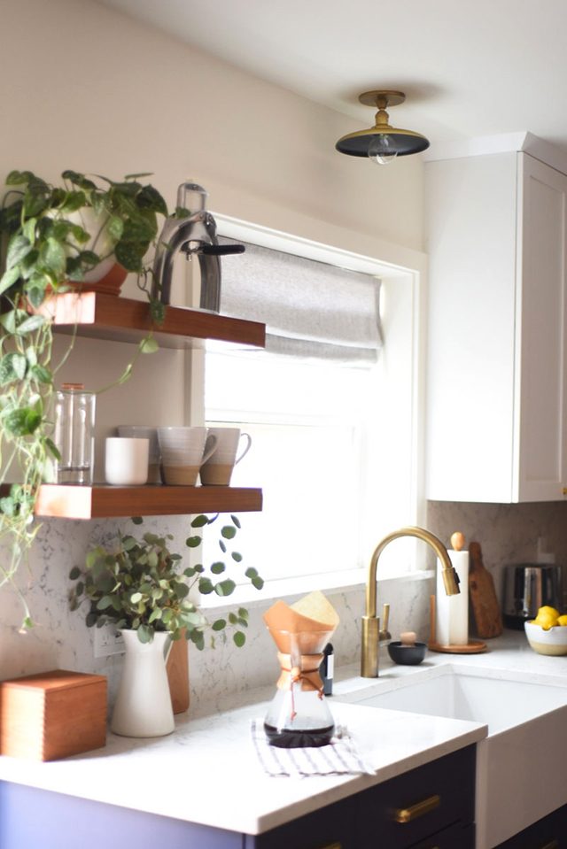
Selecting the countertop material and backsplash
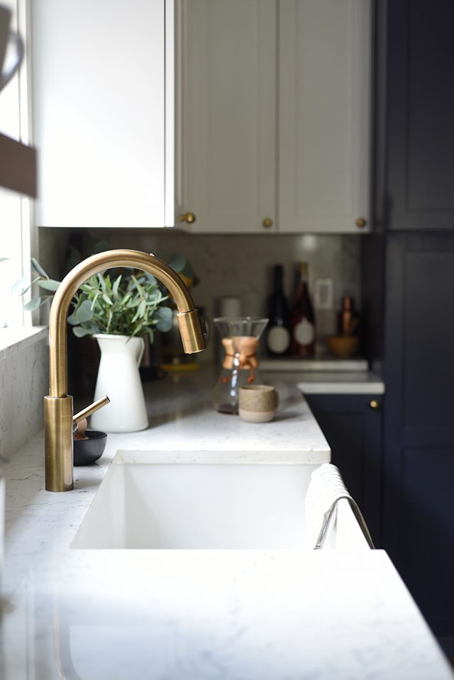
We wanted to compliment the rich navy lower cabinets with a crisp, fresh, and timeless countertop and turned to Caesarstone‘s quartz surfaces (the stone is molded and pressed into slabs and is known for its durability). We opted for one of the newer colors in their collection called White Attica, which features gorgeous gray veining, and after much back and forth, and incredible guidance from our local fabricators, Granite and Marble Specialties , we opted to extend it all the way up to a full-height backsplash. Now that we’ve been living with it for several months, I can tell you that it was definitely a good choice for us. Kressi at Granite and Marble Specialties recommended that we use the same slab for both the counter and backsplash (the fabricators cut the stone for us for the backsplash) in order to create a seamless transition. It’s ridiculously easy to clean (I usually wipe down with a mixture of vinegar and water, then wipe clean with water) and makes the space feel so spacious.
Choosing the appliances
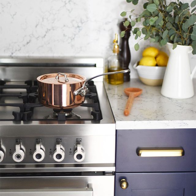
For our appliances, we teamed up with the Italian brand Bertazzoni for our refrigerator, gas range, hood, and dishwasher. Our new appliances have been nothing but a dream (and they look like a dream, too). The refrigerator feels infinitely more spacious than our last, and cooking on gas is SO MUCH fun. Although I had read that Bertazonni ranges lack digital features, I actually haven’t missed them at all. This year was the first time we hosted Thanksgiving dinner at our house (with my parents in our new kitchen!) and I kid you not, our Thanksgiving turkey was the best we’ve ever had (thanks to The Faux Martha, bookmark it people). Our dishwasher is also the quietest one I’ve ever encountered. Sometimes I don’t even know that it’s running.
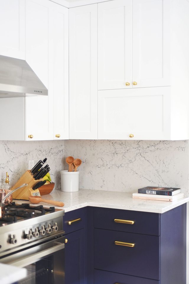
Deciding on the hardware
No kitchen would be complete without hardware that will stand the test of time (in my opinion) and for that we turned to our friends at Rejuvenation, who offer a wide range of solid brass knobs and pulls that are to die for. For some reason, when I think of a traditional-modern kitchen, I think of brass, and while I know it’s trendy now, I also know it’s always been a solid choice, so we ran with an aged brass finish since we didn’t want to get too shiny. Here are our knobs and pulls, if you’re curious.
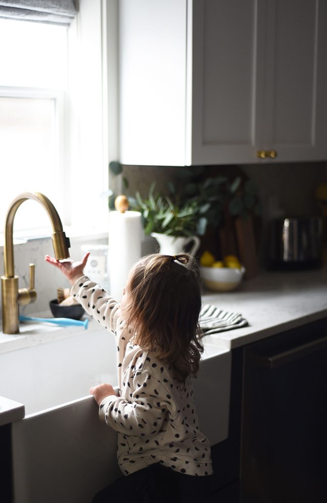
Creating the perfect sink and faucet combination
Having a farmhouse sink has always been a dream of mine, so we splurged on this one. It got a major upgrade from our antique brass Newport Brass faucet which I feel like will live in this house for another hundred years (or more!). It’s changed the dishwashing game for us, and proven to be handy for filling up heavy pots and watering plants, too. It’s not an eyesore, either.
Dressing the window
We decided to give our kitchen window a facelift, too, by giving it the same treatment as our bedroom (the scene of our “serene listening space“) with a lovely gray linen roman shade from Barn & Willow. It gives us just the right amount of privacy at night and feels especially fitting during Seattle’s gray winter months.
Adding the finishing touches
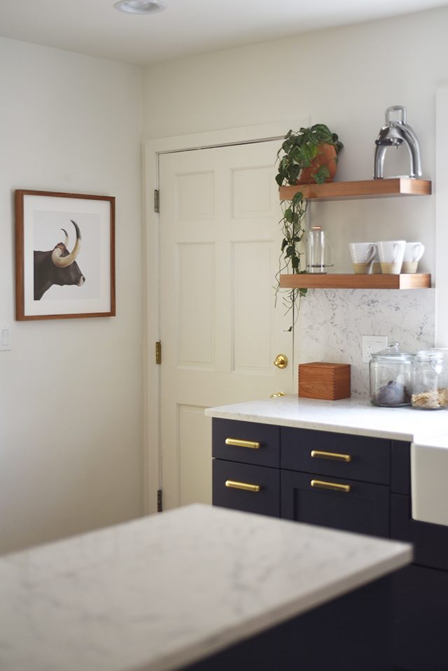
Last but not least, we perked up every nook and cranny with thoughtful touches. We repainted our door with Behr paint, and updated our hardware to a long-lasting and high-quality set from Grandeur Hardware , gave our walls some extra personality with a Schoolhouse Electric steel wall clock and a framed longhorn print from Randal Ford. The pendant above the sink is also from Schoolhouse Electric and adds just the right touch of “romantic lighting.” We finished the room with a stunning wool runner from Annie Selke, which feels so nice under bare feet.
I kid you not, I spent a ridiculous amount of time trying to find the perfect runner. We debated between a Persian rug, something simple (like a plain striped one) and s kilim, but ultimately landed on the diamond-pattered blue Annie Selke one because it felt like “us.”
Incorporating music
Of course, no Turntable Kitchen kitchen would be complete without some music. Unfortunately, a record player wouldn’t fit, so we opted for a bluetooth speaker from Vifa, which is sleek, portable, and features really high-quality audio (we connect it to our Echo/Alexa!). You can find it on Amazon!
From the bottom of our hearts, we’d like to thank all of the amazing people and companies who helped make this dream a reality. We hope this kitchen will be the site of many new discoveries (both food and music-related) and we are thrilled to welcome you — virtually — into our home. I’ve included links to everyone who played a role in this renovation. Thank you, thank you!
If you’d like to read about our plans, and see some “befores” you can do so here.
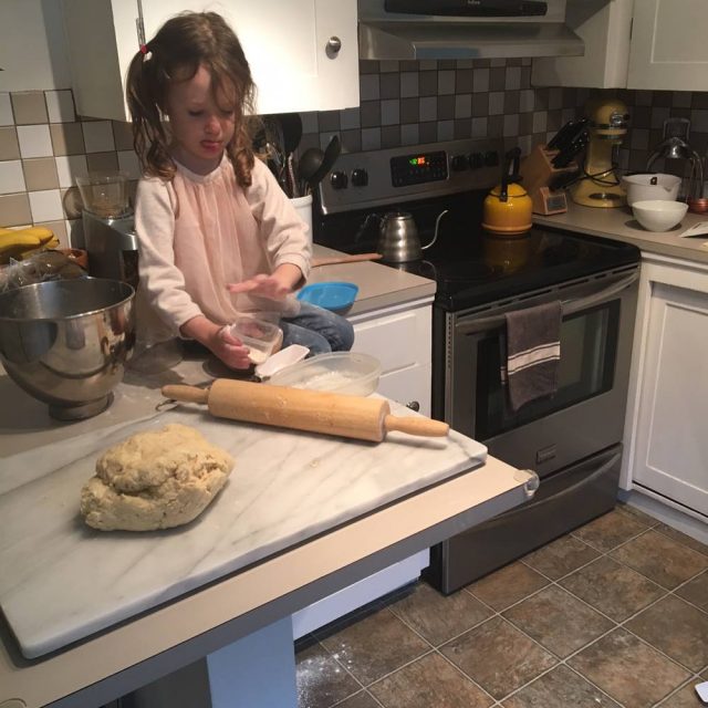
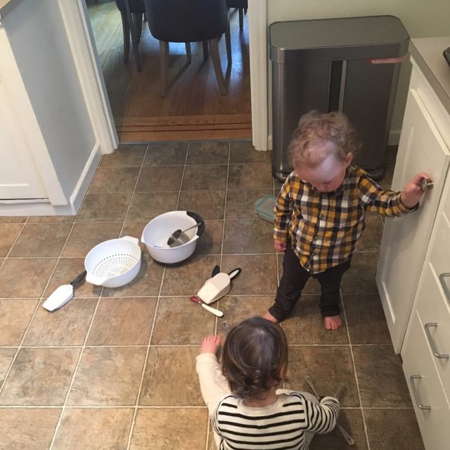
Oh and just for fun, here are a few pics of it pre-reno (we’re so happy to see that checkered backsplash and linoleum floor go) 🙂 We had our flooring guys refinish the original wood floors on the first floor of our house and put in new wood in the kitchen (they brought in red oak from Canada to match!).
Our partners include:
UltraCraft Cabinetry, Caesarstone, Bertazzoni, Rejuvenation, Schoolhouse Electric, Barn & Willow, Granite and Marble Specialties, Grandeur Hardware, Newport Brass, Heidi Caillier Design, Vifa, Farmhouse Pottery, Mauviel, John Boos, Randal Ford, Annie Selke, Parachute Home, Yield Design, and Lightwell Co.

